


Finding the balance between ‘bold’ and ‘tacky’ is the ultimate challenge of animal print. Managing a facility with over 200 workers gives me a front-row seat to the 2026 order books, and I can tell you that animal prints are no longer just a trend—they are a new neutral. But to wear them with confidence, you must first understand their character. Is it the energetic, solid-spotted cheetah or the sophisticated, rose-patterned leopard that fits your brand? In this guide, I’m decoding the technical differences between these iconic prints and revealing the 7 must-have styles this season, along with a manufacturer’s tips on finding the perfect drape and silhouette for each.
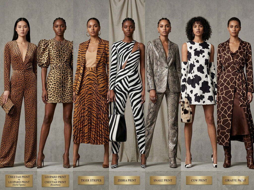
Many people confuse leopard print with cheetah print, but the two actually have very different styles and visual effects.
Cheetah print feels more sporty, while leopard print leans more toward luxury fashion.If you want to create an energetic and athletic vibe, cheetah print is usually the better choice. If your goal is a more elevated, fashionable, and Western-inspired look, leopard print is often the preferred option.
When selecting animal-print fabrics, I usually start by examining them under bright light. This makes it easier to see pattern details, color depth, and print quality, and helps avoid issues like fading or blurry prints in bulk production. For brands, this step can significantly reduce returns and production delays.
Next, look closely at the pattern structure. Cheetah print features small, solid circular or oval spots with a more even layout. Leopard print, on the other hand, has open “rosette” shapes with lighter centers and irregular clustering.
Cheetah print usually has a warmer brown tone, giving it a lighter and more sporty feel. Leopard print offers a wider range of base tones—from sand to golden brown—creating a richer and more fashionable visual effect.
For activewear, yoga sets, or everyday casual outfits, cheetah print is often the better choice due to its youthful and energetic look. For evening wear, date outfits, or fashion-forward Western styles, leopard print is better for achieving a more elevated, sexy aesthetic.
Many suppliers use “leopard” and “cheetah” interchangeably, so don’t rely only on product titles. Always request close-up images to accurately confirm the print type.
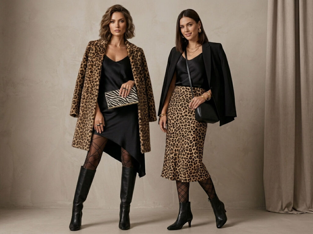
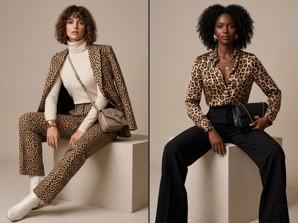
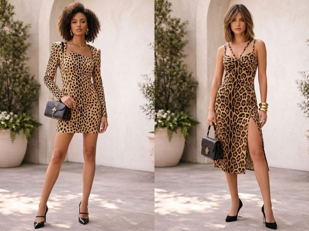
Smaller animal prints tend to look more refined and versatile, suitable for shirts, skirts, and fitted pieces. Larger leopard prints create a stronger visual impact and work well on coats, bags, and statement fashion items.
Feature | Cheetah Print | Leopard Print |
🟤 Spot Type | Solid dots | Rosette (ring-shaped) patterns |
🎯 Overall Mood | Sporty, casual, youthful | Luxurious, bold, high-fashion |
👗 Best Products | Leggings, T-shirts, activewear sets | Dresses, coats, fashion pieces |
🔍 Quick Check | No hollow center | Light or empty center inside spots |
In many products, “jaguar print” and “leopard print” are mislabeled or used interchangeably—even on transparent packaging or ribbons where everything is simply tagged as “Leopard Print.” While this may seem convenient, it can actually be risky for brands, as it weakens product credibility and disrupts the overall visual storytelling.
In reality, although both belong to the animal-print family, their visual structures and aesthetics are not the same.
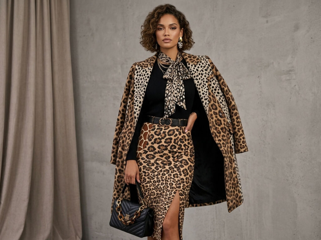
Jaguar print is generally more bold and visually intense than leopard print. Its patterns are larger and heavier, often featuring a solid dot in the center. This gives it a stronger sense of power and dramatic visual impact.
Leopard print, on the other hand, follows a more classic fashion language. It features open “rosette” shapes with softer layering, making it more versatile for high-end womenswear and everyday fashion pieces.
I only truly realized this after a client complaint. The client said a “leopard print coat” felt too heavy. Later, I discovered it was actually jaguar print.
Jaguar print is generally more striking than leopard print: the patterns are larger, darker, and often include a small dot inside the ring shape. This creates stronger contrast, making it highly photogenic under studio lighting.
Because of this visual impact, jaguar print works well for e-commerce ads and hero visuals where attention is key. However, in office wear or everyday commuting outfits, it may feel too bold or overpowering.
When sourcing fabrics, I usually request both leopard and jaguar print swatches. I compare them against skin-tone or neutral base fabrics to evaluate their visual “weight” and overall wearing mood.
Jaguar print pairs strongly with black and white for a high-impact look, while leopard print works better with softer tones like camel and beige, creating a more natural and balanced aesthetic.
🎯 Element | 🐆 Leopard Print | 🐆 Jaguar Print |
🟤 Rosette Size | Medium | Large & bold |
🎯 Center Dot | Rare or subtle | Common and more visible |
⚡ Contrast | Medium, softer visual impact | High contrast, stronger impact |
👗 Best Use | Everyday luxury, wearable fashion | Campaign visuals, statement pieces, iconic designs |
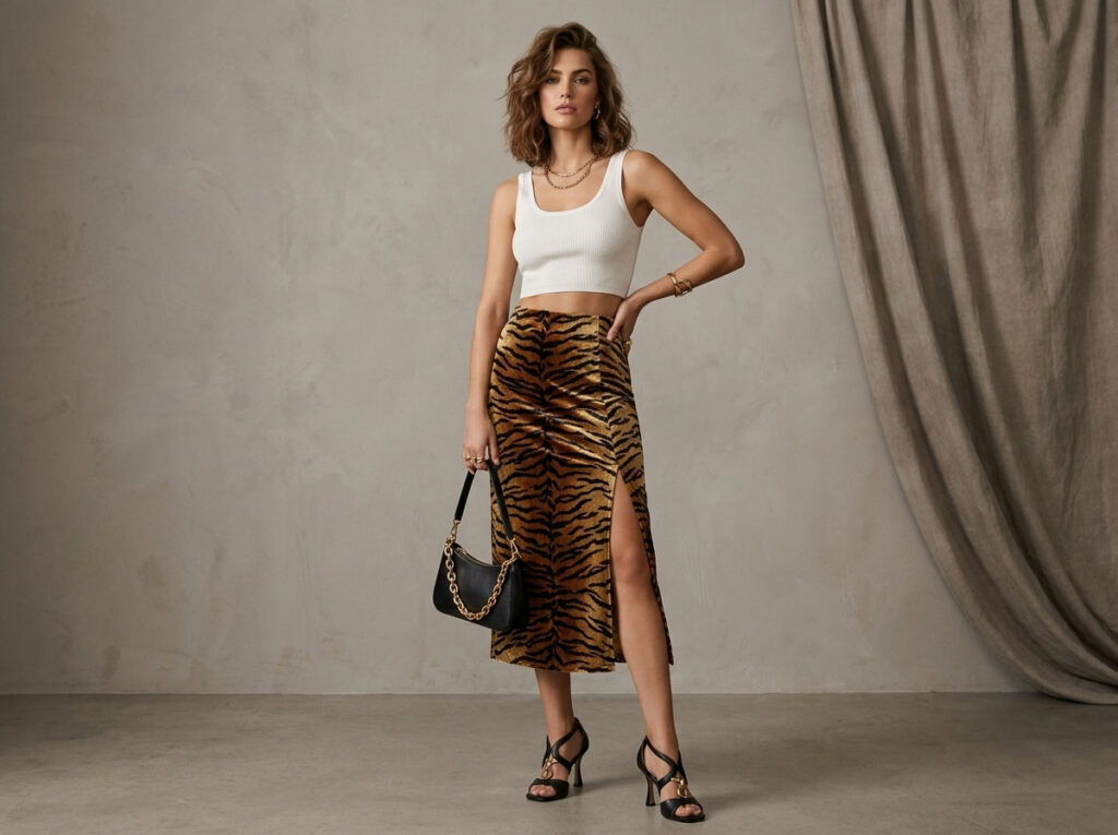
Tiger print is made up of irregular vertical stripes. It has a clean, highly recognizable look and is generally easier to control than spotted animal prints in terms of design consistency and production.
Compared to the more complex dot-based structures of leopard or jaguar prints, tiger stripes are less likely to distort across different sizes or fabrics, making them more reliable in sampling and bulk production. For styling, it is best to pair tiger print with solid-color pieces and keep accessories minimal, allowing the stripes to remain the visual focus.
When developing tiger print (stripe) garments, I don’t focus only on the pattern itself. I always start with the silhouette and fabric, because stripe direction, width, and fabric weight directly determine whether the final garment looks premium.
I usually begin testing tiger prints on bias-cut skirts. The bias cut naturally adds movement and drape, enhancing the dynamic feel of stripes.
Slight inward-leaning stripe directions can also create a slimming visual effect, helping elongate the body line.
For tops, I typically choose medium-width stripes. This helps avoid visual crowding in the chest area.
Fabric choice completely changes how stripes are perceived:
The same print can feel entirely different depending on fabric behavior.
Stripe garments require precise craftsmanship, especially seam matching.
If side seams are not properly aligned, the continuity of the stripes is broken, making the garment look unprofessional and lowering its perceived quality.
For wholesale or bulk production, I always request fabric repeat measurements in centimeters from the mill.
🎯 Factor | 💡 Why It Matters | 🛠️ What to Do |
🔺 Stripe Direction | Affects slimming effect and body shaping | Use vertical stripes or slight angled placement to enhance visual elongation |
📏 Stripe Width | Impacts visual balance and overall harmony | Medium-width stripes work best for tops; avoid overly thin or wide designs |
🧵 Fabric Weight | Determines stripe clarity and overall style | Knits create structured, crisp lines; chiffon gives a softer, flowy appearance |
✂️ Seam Matching | Ensures visual continuity and premium look | Require precise stripe alignment and proper pattern matching during production |
Zebra print is made of black-and-white stripes, giving it a minimal color palette that allows it to function much like a neutral tone in styling.It pairs easily with bold colors such as red, cobalt blue, or camel, making it simple to create striking fashion looks.
Compared to more complex animal prints, zebra print is cleaner, more versatile, and less dependent on occasion or skin tone—making it a “design-forward neutral” in modern fashion.
I’ve learned to treat zebra print the same way I treat stripes and houndstooth—as a system rather than just an animal pattern. The key lies in contrast control and capsule wardrobe planning.
At its core, zebra print is about black-and-white contrast, but different levels create very different style outcomes:
For designs that shouldn’t feel too bold, reducing tonal contrast helps soften the overall “visual volume.”
Stripe width and garment type work together:
This “light top, strong bottom” logic helps balance the overall silhouette.
The same pattern behaves very differently depending on fabric:
Fabric choice determines whether zebra print feels soft or bold.
Zebra print works especially well when paired with foundational materials:
It essentially acts as a “style amplifier” for basic pieces.
When working with a limited budget, zebra print is ideal as a “hero piece.”
A single zebra-print skirt can transform an entire wardrobe of simple tops, making 10 basic items feel newly styled.
Its value is not in quantity, but in its ability to activate the entire outfit system.
🧩 Item | 💡 Why It Works | 👗 Styling Pairing |
🦓 Zebra Midi Skirt | Acts as a visual base piece that instantly defines the outfit | Black T-shirt + red bag for a strong contrast look |
👔 Zebra Shirt | Versatile piece that works for both office and casual styling | Camel trousers for a clean, polished work outfit |
🧶 Zebra Knit Dress | One-piece outfit that requires no extra styling effort | White sneakers to balance comfort and design impact |
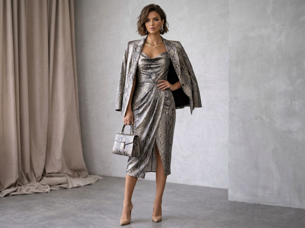
Snake print is often associated with bold or nightlife-inspired styles, but with the right design approach, it can be transformed into something much more elegant. The key is to reduce visual intensity: use fine, natural-scale textures and low-saturation tones such as taupe, sand, and soft grey to create a softer, more refined look.
At the same time, keeping garment silhouettes minimal is essential. Simple cuts allow the pattern to read as a subtle texture rather than a loud print.
When developing snake print (Python print) products, I don’t start with the pattern itself. Instead, I focus on three core variables: scale, color, and finish. These determine whether the result feels like “premium texture” or just visual noise.
I usually source micro-scale snake textures from textile mills. From a distance, these fine scales resemble a natural surface rather than an obvious animal print.
The finer the scale, the more understated the look—and the easier it is to achieve a “luxury fabric” impression instead of a loud pattern.
For color development, I prefer low-saturation neutral tones such as:
Taupe
Sand
Soft Grey
These tones significantly reduce the aggressiveness of snake print, shifting it toward a more “quiet luxury” aesthetic rather than a bold visual statement.
The surface finish is critical for elevating snake print:
I adjust the execution depending on the product:
In product catalogs and e-commerce shoots, close-up shots of snake print are essential. They allow customers to clearly see the scale and texture, which enhances perceived material quality and depth.
🎯 Dimension | 🧩 Safer Choice | ⚖️ Balanced Option | 🔥 Bold Choice |
📏 Scale | Micro-scale texture | Medium scale | Large-scale pattern |
🎨 Color Palette | Taupe / Grey tones | Natural neutral mix | Emerald / Bronze |
✨ Finish | Matte | Semi-matte / subtle sheen | High-gloss |
👗 Best Use | Belts, shirts, small accessories | Skirts, tops | Dresses, boots, statement pieces |
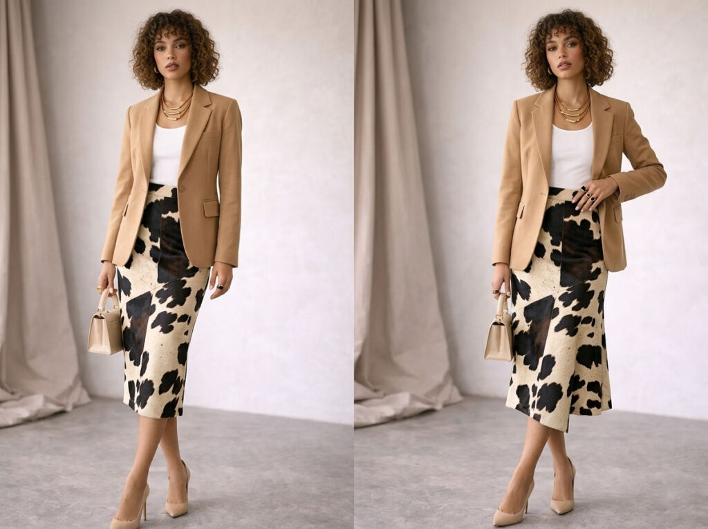
Cow print is not limited to a single aesthetic. Its overall style depends on how the design details are controlled, allowing it to shift between streetwear and fashion-forward looks.
A cream base with small spots creates a more refined and elegant fashion feel, while a pure white base with larger spots delivers stronger contrast and a more street-style, high-impact appearance. In general, the key to cow print’s versatility lies in contrast control rather than the pattern itself.
In real market testing, I found that cow print is not a fully “all-season” pattern—its performance changes significantly depending on season, region, and styling approach.
When testing cow print handbags across different markets, the results were very clear:
This shows that base color directly influences seasonal perception.
In outfit styling, cow print is already visually strong. Therefore, I usually follow one rule:
👉 Only one cow print item per look
For example, a mini skirt or a handbag is enough to define the outfit. This avoids visual overload and keeps the styling balanced.
I avoid mixing cow print with other high-impact animal prints such as:
These patterns compete for attention and dilute the visual focus of the outfit.
Cow print also shifts with seasons:
Because cow print has strong contrast, any sewing misalignment becomes very noticeable. In production, I always require:
👗 Item | ✨ Fashion Route | 🧢 Street Route |
👗 Skirt | Small spots + cream base for a refined, elegant look | Large spots + pure white base for a bold, high-impact look |
👜 Bag | Structured silhouette with a clean, polished finish | Oversized tote for a relaxed, exaggerated street feel |
🧥 Outerwear | Cropped jacket emphasizing proportion and lightness | Puffer jacket for volume and stron |
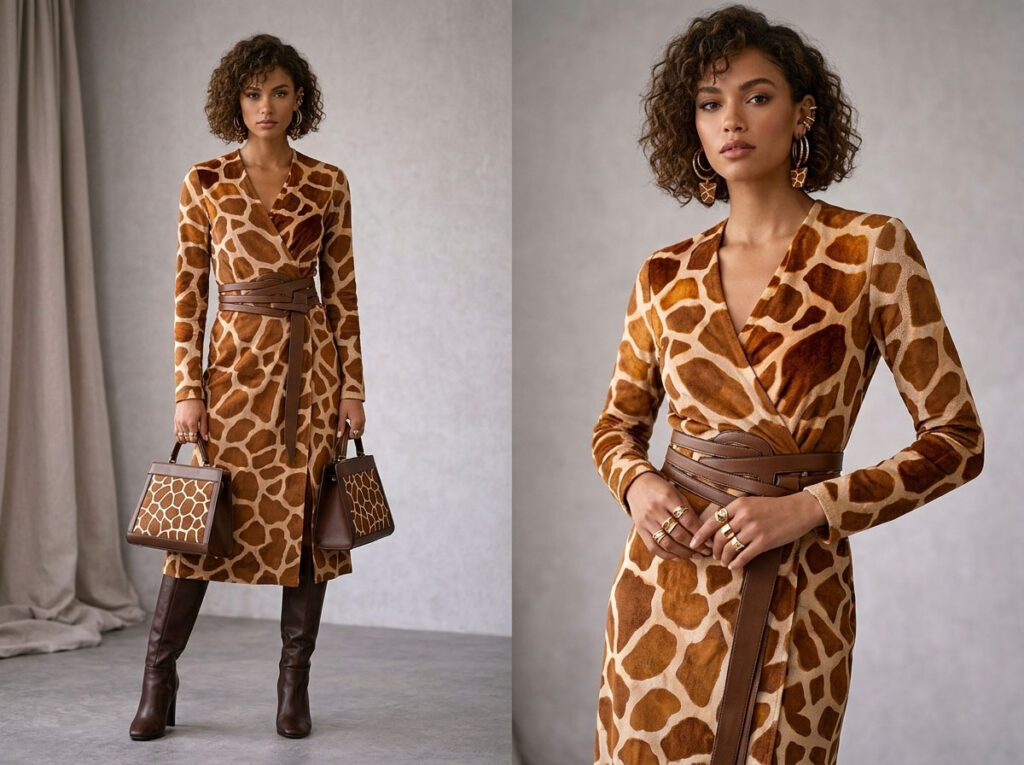
Giraffe print is often overlooked compared to other animal prints, but it offers a balanced mix of visual interest and subtle elegance without being too aggressive or high-contrast. It features large, irregular shapes with soft edges, creating a more natural and artistic look that feels calmer than leopard or zebra prints.
It works especially well in dresses and outerwear, where it can add a refined, artistic touch without overpowering the design. Overall, giraffe print delivers a “soft impact”—visually engaging but still controlled and elegant.
My first attempt with giraffe print was on a wrap dress for a buyer looking for something fresh but not overly bold. The large, irregular giraffe-inspired panels subtly defined the body’s silhouette.
The large patch-like shapes of giraffe print can actually be used to reshape visual proportions. On a wrap dress, they guide the eye naturally along the body.
When the panels gradually taper toward the waist, they create a soft hourglass effect without relying on structured tailoring.
Soft crepe fabrics enhance the strengths of giraffe print, allowing the pattern to move with the body and create a fluid, elevated silhouette.
Compared to stiffer materials, it emphasizes drape and movement rather than structure.
I prefer warm neutral tones such as:
I avoid harsh black outlines, as they break the natural flow and make the pattern feel too rigid.
For outerwear, I carefully position the panels around the lapel area to draw the eye upward and enhance presence.
For small accessories, I reduce the scale of the pattern to avoid a “too busy” or patchy appearance.
Giraffe print pairs particularly well with texture-focused elements:
🎯 Detail | 💡 Why It Matters | 🛠️ Action |
🔺 Panel Tapering | Creates a slimming effect and improves body proportion | Use gradual narrowing at the waist area |
🌫️ Fabric Drape | Enhances fluidity and a premium feel | Choose soft crepe or lightweight flowing fabrics |
🎨 Color Palette | Defines the overall warm and refined mood | Use caramel, coffee brown, and cream tones |
✨ Hardware & Finishing | Elevates refinement and final product quality | Opt for gold hardware and tan-toned trims |
Yes—but the key is to “define hierarchy.” Otherwise, the patterns can look chaotic.
✔ One pattern: small scale + warm tones (acts as the base for stability)
✔ The other pattern: large scale + cool tones (acts as the focal point for visual impact)
In combining leopard and cheetah prints, success is not about whether they can be mixed—but whether they are structured properly. I use a simple three-step framework to keep designs visually rich yet controlled, especially useful for product catalogs and bulk styling decisions.
The first step is not choosing a “nice pattern,” but establishing the core tone of the design.
👉 Purpose: define the overall identity of the garment first.
The second step is the most important design control: pattern sizing hierarchy.
👉 Core rule:
Never let both patterns compete for attention.
The final step is what creates a high-end finish: color system alignment.
👉 Color is not decoration—it is what “binds” the entire design into one coherent system.
Because this is not just a styling idea—it is a repeatable decision framework:
Base Item | Accent Item | Tone Logic | Visual Result |
Leopard jacket | Cheetah scarf | Warm base + cool accent | Balanced contrast, more stability |
Cheetah T-shirt | Leopard bag | Cool base + warm emphasis | Clearer layering, stronger structure |
Leopard skirt | Cheetah sneakers | Neutral + neutral | Sporty yet fashion-forward fusion |
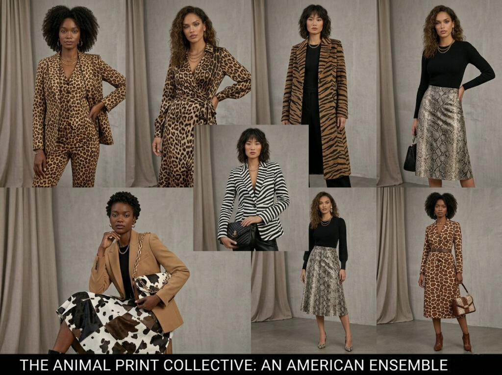
Cheetah print brings soft, dotted energy, while leopard print delivers bold, rosette-like structure. The best choice is not about which is “better,” but about how you align prints with mood, scale, and color balance.Once you understand this logic, animal prints become a flexible design system rather than isolated patterns.From there, you can expand your styling vocabulary—mixing zebra, tiger, snake, cow, and giraffe prints to build a modern, expressive wardrobe that feels intentional rather than chaotic.
At Liantao Apparel, we are more than just a garment manufacturer—we are a development partner that helps clients build a sellable print system.
We approach development from the language of patterns, supporting clients in styling decisions and collection building. For example, cheetah print is expressed through fine dotted structures, creating a lighter and more youthful visual rhythm, while leopard print is interpreted with a rosette-like structure, delivering a more stable and classic identity.
Building on this foundation, we further expand into a wider animal print system: zebra stripes for linear visual impact, tiger stripes for strength and intensity, snake print for fluid movement, cow print for minimalist contrast, and giraffe print for geometric segmentation. Through the complementary nature of these patterns, we help clients construct complete and coherent collection stories.
From design development and sampling to bulk production and final sales presentation, we ensure that each print group is not only visually consistent, but also clearly differentiated in the market—driving stronger product clarity and commercial conversion.
Hi, I’m Lucy Cai, the founder of liantaoapparel.com. I’ve been managing a women’s clothing factory in China for over 16 years. With extensive experience in garment production and OEM services, I’m passionate about sharing insights into women’s fashion, apparel manufacturing, and global sourcing.
If you have any questions or need a quote, please contact us.
Please add us WhatsApp:+86 189 4809 3145
Provide us with detailed information about your requirements, supply design drawings or tech packs,
reference images, and share your ideas.
We will customize the best solution based on your needs and drawings, and provide a specific quote within 24 hours.
Once we receive your confirmation and deposit,we will commence mass production and take care of the subsequent shipping arrangements.


