


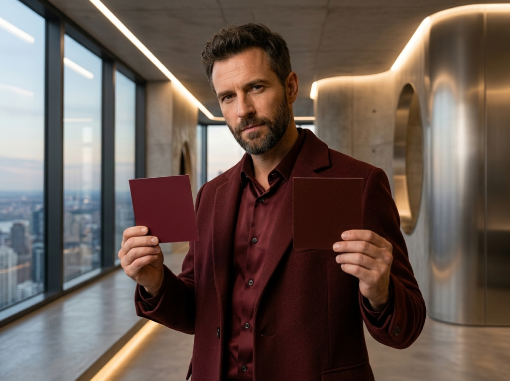
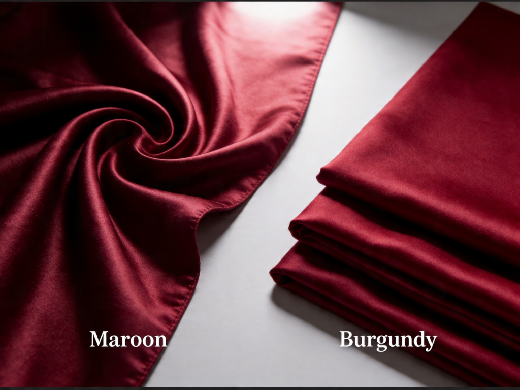
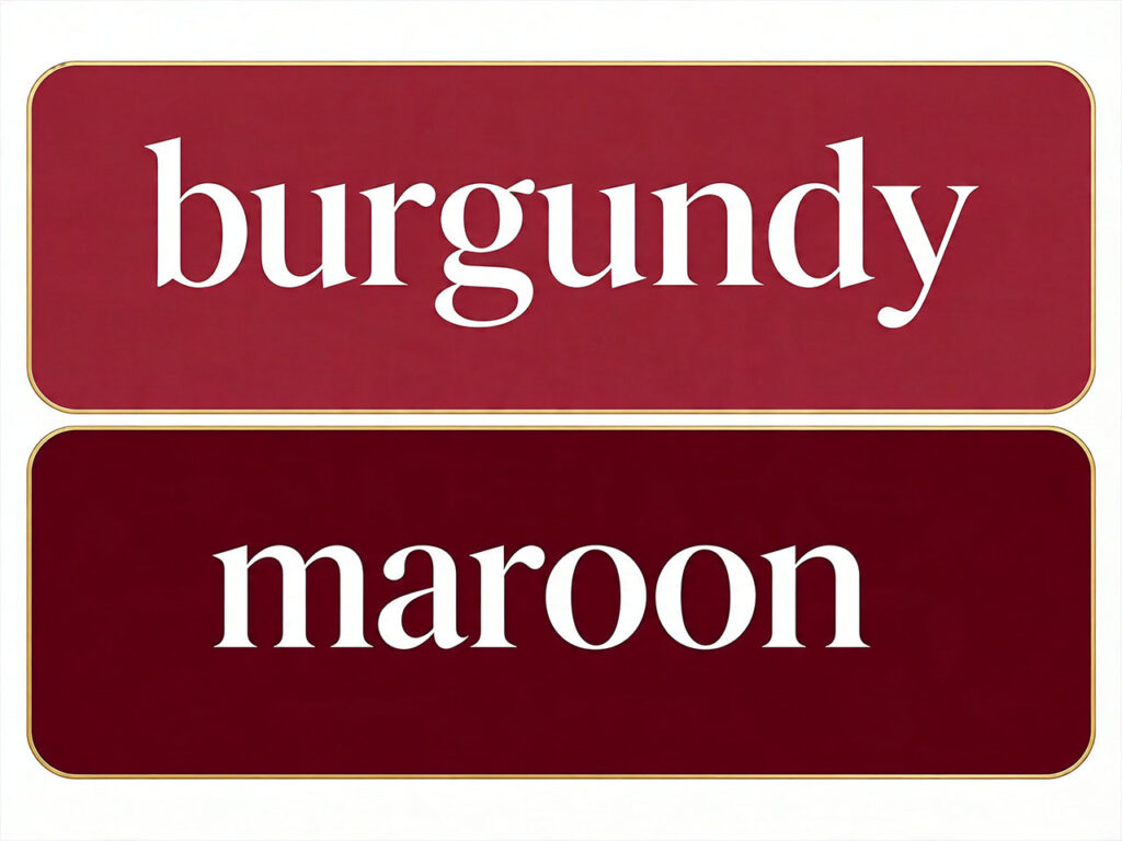
In my 20 years on the factory floor, I’ve seen countless designers label a swatch as ‘Burgundy’ when it was technically a ‘Maroon’—a mistake that completely changes the mood of a collection. While they both belong to the family of deep reds, these two colors are built differently: one leans into sophisticated purple undertones, while the other is grounded in warm, earthy browns. Whether you’re a fashion brand sourcing the perfect shade or a shopper looking for your next statement piece, understanding the subtle science of these hues is the key to mastering high-end style. Today, I’m putting these colors under the professional lens to settle the debate once and for all.
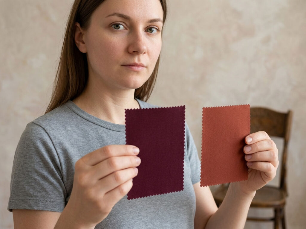
Have you ever experienced this? You see a swatch labeled “dark red,” place your order with high expectations, but feel slightly disappointed when you finally open the box. The color isn’t exactly wrong—it’s just not what you had in mind. The issue usually isn’t the “red” itself, but the undertone behind it.
The most effective and professional way to tell them apart is to observe the fabric under natural light against a white background. Burgundy typically carries a subtle wine-purple undertone, giving it a cooler, more refined and elegant feel. In contrast, brownish red contains a noticeable brick-brown undertone, making it warmer, more vintage, and grounded. Though both fall under “dark red,” their visual impact is completely different.
If you need a faster way to decide, use this simple rule: if the color feels cool and slightly distant, it’s likely Burgundy; if it feels warm, heavy, or slightly earthy, it’s brownish red.
This subtle difference in undertone can significantly affect the final look and positioning of your product. That’s why confirming the exact color direction before sampling or bulk production is far more important than fixing mistakes later—it saves both time and cost.
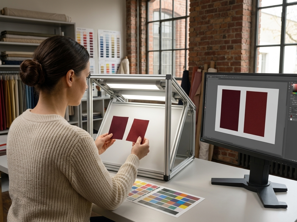
In practice, I rely on a simple yet highly effective method—the white paper test. Place the color swatch on a clean white sheet and observe it under natural daylight or a D65 light source to reveal its true undertone. Typically, Burgundy leans toward a reddish-purple tone, giving it a cooler, more refined look, while chestnut (brownish red) shifts toward a red-brown tone, appearing warmer and more grounded. This quick check is especially useful before sampling, helping you confirm the right direction from the start.
Understanding how colors are built makes it easier to predict results. If you deepen red by adding black, the outcome tends to move toward a brownish, chestnut tone. On the other hand, if you adjust red with a touch of blue or magenta, it will shift closer to Burgundy with a subtle purple undertone. This logic is not only helpful for design decisions, but also makes communication with factories far more precise.
In real-world workflows, many teams share images instead of physical fabric, which naturally introduces color variation. Instead of relying on a single color code, it’s more practical to define a target color range. Different textile mills, printing houses, and screen-printing processes can all affect the final outcome. Providing a flexible but controlled range is a more professional approach—and significantly reduces the risk of repeated revisions.
Name | Hex | RGB | Undertone |
Typical Burgundy | #800020 | 128, 0, 32 | Red-purple, cool, refined |
Deep Burgundy | #7B112C | 123, 17, 44 | Rich wine tone, slightly cooler |
Classic Maroon | #800000 | 128, 0, 0 | Red-brown, warm, classic |
Dark Chestnut | #5E0000 | 94, 0, 0 | Brown-heavy, warm, earthy |
In real communication, a simple and clear instruction is often more effective than a long explanation. For example, I often write: “Prefer a cool-toned Burgundy, avoid brownish undertones.” Just this one line can significantly reduce misunderstandings.
Once, a client only specified “dark red” for a logo. The factory produced a brownish result, which looked more like an aged red rather than the intended premium Burgundy. Later, we simply added one clarification: “lean toward a purple undertone, avoid brown.” The second sample was almost perfect.
I once saw a burgundy jacket that was photographed in a way that made it appear brownish-red. Although the product itself was correct, the visual presentation completely shifted—what was meant to feel premium and cool-toned lost its elegance and started to look more ordinary and warm-toned. The sales team also clearly felt the impact: the same garment can perform very differently depending on how the color is presented.
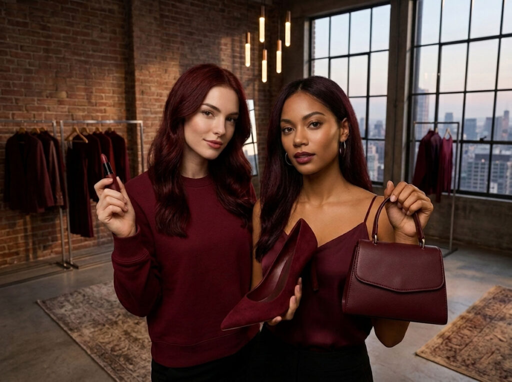
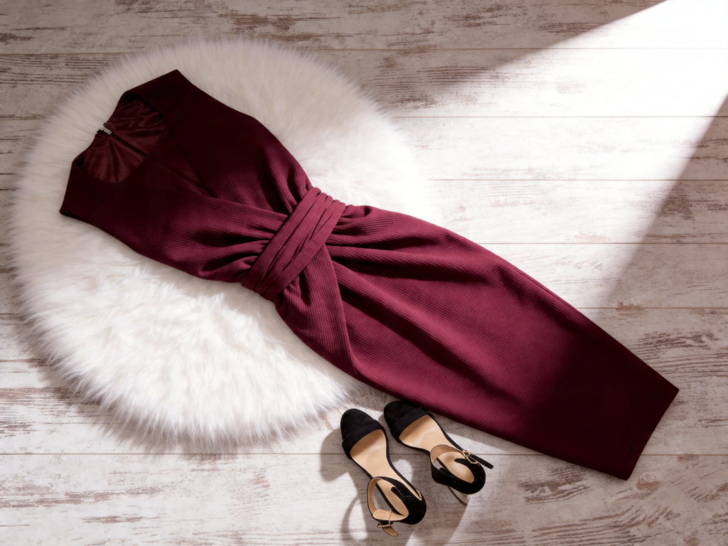
Burgundy is better suited for high-end collections, evening wear, and cool-toned brand aesthetics. It communicates refinement, restraint, and sophistication. Chestnut or brownish red, on the other hand, aligns more with classic, collegiate, and warm vintage styles, emphasizing approachability and nostalgia. Neither is “better”—the key is whether it matches the brand’s positioning.
What truly determines the final result is not just the color choice itself, but the control across the entire production chain—including lighting conditions, background selection, and fabric finishing treatments. Only when these variables are standardized can you ensure that the undertone remains consistent from lab dip to bulk production, without unintended shifts in perception.
In apparel and branding, color is not an isolated parameter but a visual language. Consistent color expression is what preserves brand identity and ensures that products maintain a premium, cohesive look across all channels.

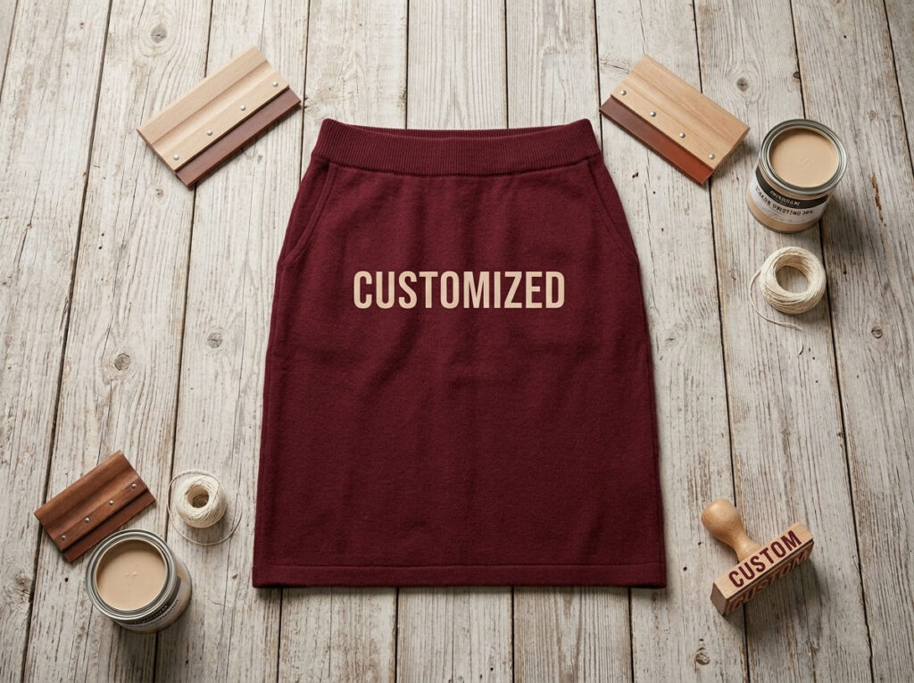
In real product development, I always start by aligning color with fabric rather than selecting color in isolation. On satin, Burgundy appears more luxurious because its purple undertone works in harmony with the sheen, enhancing visual richness. On fleece, chestnut feels more stable and grounded, as the brown undertone softens the overall appearance. On leather, Burgundy emphasizes sophistication and a premium feel, while chestnut leans more toward a vintage and classic aesthetic. The same color can communicate completely different brand messages depending on the material.
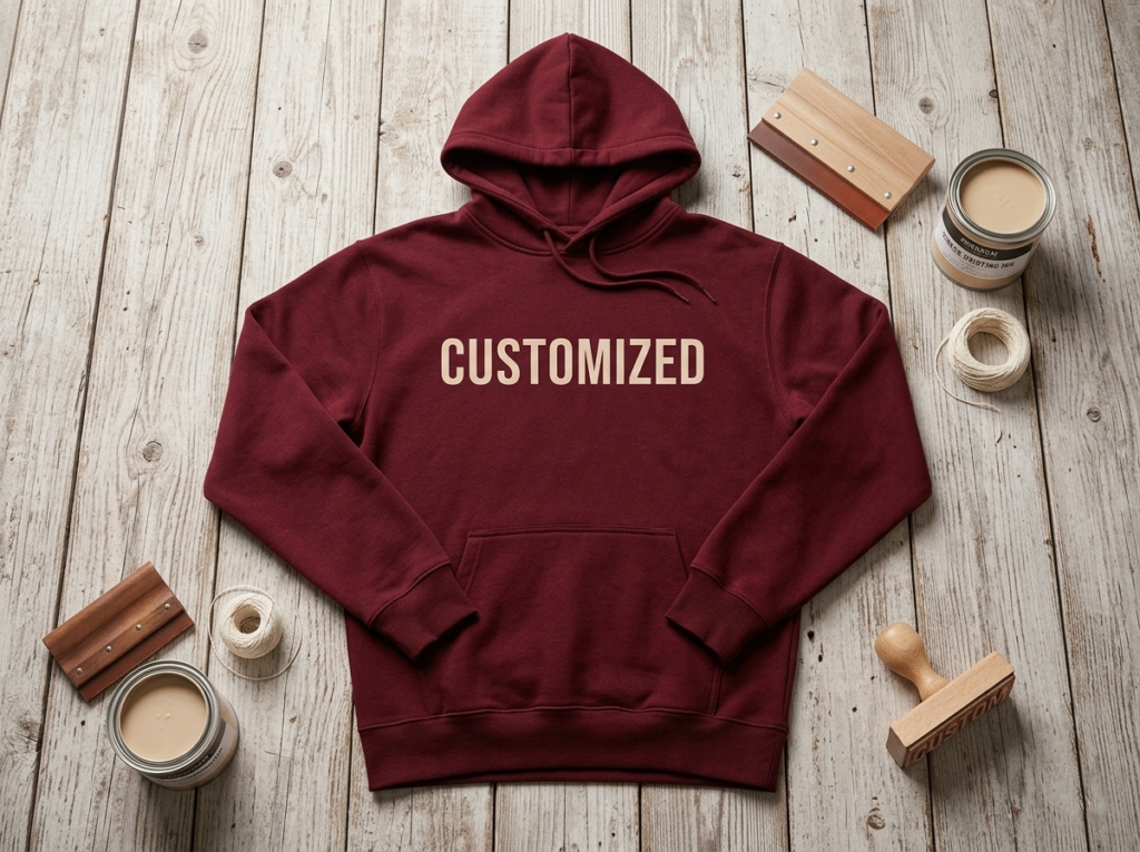
Color selection should ultimately serve the product’s intended use. For women’s dresses and handbags that emphasize elegance, refinement, and premium positioning, when the brief includes “Burgundy” or “Burgundy vs. dark red,” a rich Burgundy tone is usually the more suitable direction. For men’s T-shirts, collegiate sweatshirts, and more functional or team-oriented styles, in contexts like “dark red vs. chestnut” or “blood red vs. Burgundy,” chestnut tends to be more stable and widely accepted.
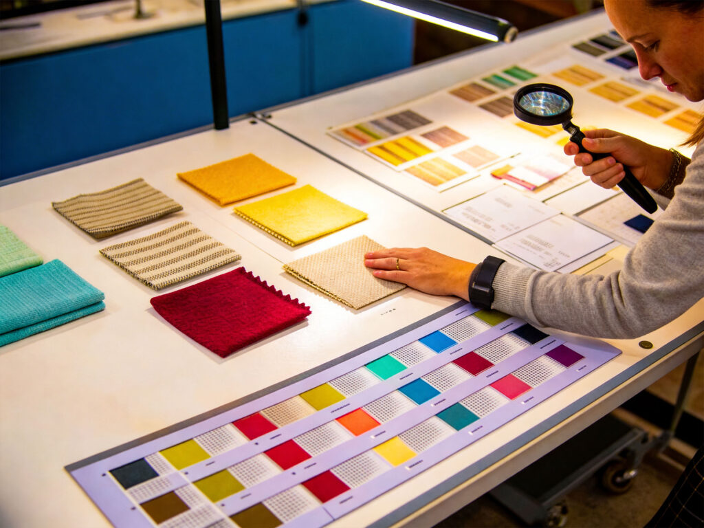
A common issue is the loose use of color terminology. Terms like “Burgundy,” “Wine Red,” “Merlot,” and “Cranberry” are often treated as interchangeable, but they actually sit in different color families with noticeable differences in undertone. Because of this, I never rely on naming alone in development. Instead, I require color swatches or Pantone references to ensure everyone is working within the same visual standard.
Color is not limited to the main fabric—it extends to all secondary materials such as linings, ribbing, and stitching. If these elements are not aligned in tone, the overall look can become visually fragmented. For example, a Burgundy body paired with warm-toned chestnut ribbing may create a noticeable mismatch under natural light or on camera, weakening the sense of premium quality. Therefore, all auxiliary components must follow the same color system to maintain visual coherence.
Professional color management is not about selecting “a red,” but about controlling a system across fabric, application, naming standards, and trim coordination. Only by treating color as an interconnected system—not an isolated decision—can you ensure consistent visual identity, brand expression, and market performance in the final garment.
Category | Better Choice | Why |
Evening dresses / handbags | Burgundy | Cool purple undertones create a refined, premium, and elegant look, ideal for formal and luxury settings |
College sweatshirts / caps | Chestnut | Warm red-brown tones feel more heritage-driven and approachable, fitting collegiate and casual styles |
Custom outerwear | Burgundy | Shows richer depth under studio lighting and natural light, enhancing a premium visual effect |
Kids’ basics | Chestnut | Softer and warmer tone, more suitable for cotton and fleece fabrics, and more practical for everyday wear |
It’s not about which red is “better,” but which red fits the product. Burgundy leans toward a premium, high-fashion expression, while chestnut feels warmer and more functional. Choosing the right direction immediately elevates the perceived quality of the product.
During the design stage, we often see a “perfect color” on screen. However, once it moves into bulk printing or digital production, the final result can shift significantly. Chestnut and Burgundy may look similar digitally, but they often behave very differently in real output, sometimes showing a clear tonal separation.
The difference between chestnut and Burgundy is not just visual—it comes from fundamentally different color structures. Burgundy typically carries a stronger purple-red bias, while chestnut leans toward a red-brown system. During CMYK conversion and printing processes, this gap is often amplified, making them impossible to treat as the same “red.”
The real driver of consistency is not the screen color itself, but the entire color management workflow. A consistent ICC profile must be used, and monitors must be properly calibrated; otherwise, what you see on screen will not match what comes out in print. In addition, Pantone swatches remain one of the most reliable cross-team color standards.
To minimize deviation, screenshots alone are not enough when communicating with suppliers. A more professional approach is to provide LAB color values or physical swatches as a reference, giving factories a clear and measurable target instead of subjective interpretation.
In digital printing and physical production, color consistency depends on whether the entire color management system is aligned—not on the name of the color itself. Only with standardized workflows can Burgundy and chestnut be reproduced reliably across different devices and materials.
When color profiles differ, on-screen appearance becomes inaccurate. When ink batches or machines change, printed output also shifts. Color is not a fixed value—it is something continuously “reinterpreted” across different devices and materials.
In practice, I avoid treating a single Hex code as a strict rule. Instead, I rely on the LAB color model, which is device-independent and works as a stable reference across factories and software systems.
For example, I may define:
“Burgundy: LAB L 23 a 38 b 15 ±1.5”
Each production stage then converts this reference into CMYK, RGB, or pigment formulations as needed. This significantly reduces accumulated deviation between systems.
In addition to numeric values, I usually provide a color range (swatch band) instead of a single fixed color. I also add key constraints such as:
For bulk production, I require factory photos under both D65 (daylight) and TL84 (store lighting) conditions. This ensures we evaluate appearance under both natural and indoor lighting, preventing cases where the color looks correct in one environment but shifts in another.
Color behavior changes significantly depending on material and finishing. I document approval versions of “Chestnut vs Burgundy” because identical formulas can appear warmer on recycled paper or blended knits.
For example, blended chestnut may shift due to gray yarn content, requiring a separate label such as “blended chestnut” for proper tracking and control.
Color management is not only visual—it is also linguistic. For instance, in Spanish, “chestnut” is often translated as granate, but some teams may incorrectly use marrón (brown). Such small language mistakes can completely shift the intended color direction and lead to incorrect production orders.
Stable cross-factory color control does not rely on a single code, but on a complete system: LAB for direction, swatches for range control, lightbox testing for real-world validation, material tracking for surface variation, and precise language to avoid misinterpretation. Only then can Burgundy and chestnut remain consistent across a global supply chain.
Core idea
A structured handover reduces misinterpretation and ensures consistent color results across factories.
When working with brands, I always design from head to toe. In visuals, clothing, makeup, hair, and accessories must follow the same color logic—not treated separately.
Wine red is warmer (red-brown tone), while burgundy is cooler (red-purple tone). This difference changes the whole styling mood.
Matching rule: keep undertones consistent
Core idea
Styling is not mixing items—it’s building a consistent color system.
I always align every element—hair, makeup, and outfit—under one color logic. Burgundy hair works with cool tones (silver, black, charcoal), while chestnut hair fits warm tones (gold, camel, beige). This prevents mixed warm/cool signals in one look.
Chestnut sneakers pair well with casual warm outfits like off-white jeans and brown belts. Burgundy sneakers work better with sharp, cool outfits like black leggings and graphite outerwear. The goal is consistency, not random matching.
Lip color can shift the entire styling direction. That’s why I standardize “red vs. burgundy” lip choices to avoid mixing warm and cool tones in one look.
Burgundy can look dull on warm beige backgrounds, while chestnut can lose clarity on icy gray. A neutral mid-gray background keeps both colors accurate and balanced.
Customer service: clear language reduces returns
Simple definitions matter: “Chestnut is red-brown, Burgundy is red-purple.” Clear wording reduces confusion and return rates.
Item Category | Burgundy (Cool Tone / Premium Clean Look) | Chestnut (Warm Tone / Natural Soft Look) |
Jewelry | Silver, rhodium, white gold | Gold, copper, vintage gold |
Neutrals | Black, charcoal, navy, deep graphite | Camel, taupe, cream, oatmeal |
Denim | Black denim, light grey wash, cool blue denim | Off-white denim, mid-blue denim, vintage blue denim |
Lipstick | Berry tones, plum, cool rose | Brick red, rust red, caramel red |
Shoes & Bags | Black, deep purple, smoky grey | Brown, caramel, warm beige |
Blush | Cool pink, rose pink | Apricot, coral, warm brown tones |
In apparel development, the real risk is often not design—it is unclear color communication. A small deviation in undertone can disrupt the entire seasonal visual system. You don’t want to lose a selling season due to color confusion, and neither do your suppliers.
Different base tones require different color pairing directions:
The key is not whether colors “look good together,” but whether they belong to the same temperature system.
To avoid interpretation errors, it is not recommended to rely only on vague terms like “burgundy” or “chestnut.” Instead, use a three-layer communication structure:
Color issues are fundamentally communication issues. Language alone will always create variation. Only by combining numeric values, physical references, and clear undertone direction can the supply chain operate on a unified visual standard.
Key risk: color problems usually come from variables, not formulas
→ Always require D65 + showroom verification
Core case
A “cool burgundy” outerwear batch was reclassified as chestnut due to cotton blend + warm QC lighting—not a formula issue, but a system mismatch.
Core principle: PO = color control system
A proper PO must lock:
Module | Requirement | Notes |
Color Definition + Undertone | Color name + warm/cool direction | e.g., Burgundy (cool red-purple, avoid brown shift); Chestnut (warm red-brown, avoid purple/cool shift) |
Swatch Reference | Front & back swatch images | Must be taken under natural or standardized lighting for accurate visual comparison |
LAB Standard | LAB target values + tolerance range (±X.X) | Used as a unified cross-device reference (design + factory alignment) |
Lighting Verification | D65 + TL84 lightbox photos | Ensures color stability under different lighting conditions |
Approval Details | Approver name + date + version number | Locks final approved version to prevent disputes |
Burgundy is essentially a red-purple tone, while chestnut is a red-brown tone. The key difference lies in the undertone direction rather than the name itself. In real development and production, it is important to clearly define the undertone, provide LAB values as a measurable standard, and confirm the final color with physical swatches. By combining undertone specification, numerical data, and physical verification, communication errors and interpretation gaps can be significantly reduced, ensuring accurate first-time production from sampling to bulk manufacturing.
Burgundy (red-purple, cool tone) and chestnut (red-brown, warm tone) may look similar, but they belong to different color systems. If the undertone is not clearly defined at the development stage, it can lead to color deviation in sampling and bulk production. For factories, this affects dyeing formulas, fabric behavior, and finishing results. For clients, it may cause a mismatch between samples and bulk goods, where the intended premium cool Burgundy shifts into a warm brown-red, impacting brand consistency and sales performance.
Clear undertone definition, supported by LAB values and physical swatches, helps reduce miscommunication and ensures accurate production from sample to bulk order.
Liantao Apparel helps brands build a clear color control system from development to production. We use LAB standards, Pantone references, physical swatches, and multi-light source QC (D65/TL84) to ensure color accuracy and consistency across factories.
Color consistency is key to brand identity. With professional color management and factory experience, Liantao Apparel helps clients reduce errors, improve efficiency, and achieve reliable, high-quality garment production from concept to final delivery.
Hi, I’m Lucy Cai, the founder of liantaoapparel.com. I’ve been managing a women’s clothing factory in China for over 16 years. With extensive experience in garment production and OEM services, I’m passionate about sharing insights into women’s fashion, apparel manufacturing, and global sourcing.
If you have any questions or need a quote, please contact us.
Please add us WhatsApp:+86 189 4809 3145
Provide us with detailed information about your requirements, supply design drawings or tech packs,
reference images, and share your ideas.
We will customize the best solution based on your needs and drawings, and provide a specific quote within 24 hours.
Once we receive your confirmation and deposit,we will commence mass production and take care of the subsequent shipping arrangements.


